Tailwind CSS Image
Our Tailwind CSS Image component simplifies image handling and styling, offering an array of classes to achieve the image effects that you are looking in your website or application. From adjusting image sizes to creating visually appealing galleries, Tailwind CSS empowers you to optimize and customize your web images with ease.
<div class="grid min-h-[140px] w-full place-items-center overflow-x-scroll rounded-lg p-6 lg:overflow-visible">
<img
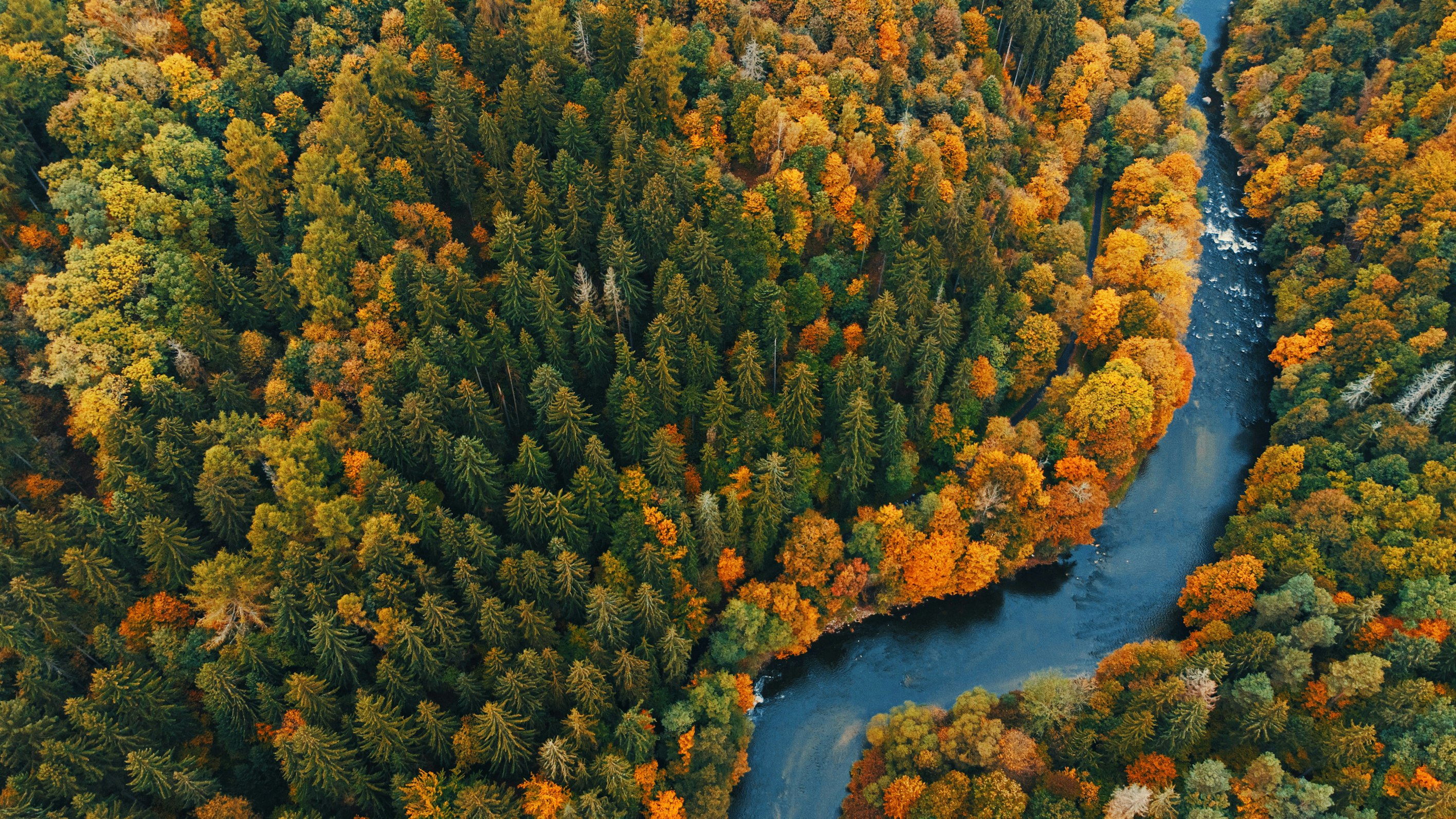
class="object-cover object-center w-full h-96"
src="https://images.unsplash.com/photo-1682407186023-12c70a4a35e0?ixlib=rb-4.0.3&ixid=MnwxMjA3fDB8MHxwaG90by1wYWdlfHx8fGVufDB8fHx8&auto=format&fit=crop&w=2832&q=80"
alt="nature image"
/>
</div>Image With Rounded Corners
<div class="grid min-h-[140px] w-full place-items-center overflow-x-scroll rounded-lg p-6 lg:overflow-visible">
<img
class="object-cover object-center w-full rounded-lg h-96"
src="https://images.unsplash.com/photo-1682407186023-12c70a4a35e0?ixlib=rb-4.0.3&ixid=MnwxMjA3fDB8MHxwaG90by1wYWdlfHx8fGVufDB8fHx8&auto=format&fit=crop&w=2832&q=80"
alt="nature image"
/>
</div>Circular Image
<div class="grid min-h-[140px] w-full place-items-center overflow-x-scroll rounded-lg p-6 lg:overflow-visible">
<img
class="object-cover object-center rounded-full h-96 w-96"
src="https://images.unsplash.com/photo-1682407186023-12c70a4a35e0?ixlib=rb-4.0.3&ixid=MnwxMjA3fDB8MHxwaG90by1wYWdlfHx8fGVufDB8fHx8&auto=format&fit=crop&w=2832&q=80"
alt="nature image"
/>
</div>Image with Caption
Image caption
<div class="grid min-h-[140px] w-full place-items-center overflow-x-scroll rounded-lg p-6 lg:overflow-visible">
<img
class="object-cover object-center w-full rounded-lg h-96"
src="https://images.unsplash.com/photo-1682407186023-12c70a4a35e0?ixlib=rb-4.0.3&ixid=MnwxMjA3fDB8MHxwaG90by1wYWdlfHx8fGVufDB8fHx8&auto=format&fit=crop&w=2832&q=80"
alt="nature image"
/>
<div class="block mt-2 font-sans text-sm antialiased font-normal leading-normal text-center text-inherit">
Image caption
</div>
</div>Image with Shadow
<div class="grid min-h-[140px] w-full place-items-center overflow-x-scroll rounded-lg p-6 lg:overflow-visible">
<img
class="object-cover object-center w-full rounded-lg shadow-xl h-96 shadow-blue-gray-900/50"
src="https://images.unsplash.com/photo-1682407186023-12c70a4a35e0?ixlib=rb-4.0.3&ixid=MnwxMjA3fDB8MHxwaG90by1wYWdlfHx8fGVufDB8fHx8&auto=format&fit=crop&w=2832&q=80"
alt="nature image"
/>
</div>Image with Blurred Caption
Sara Lamalo
20 July 2022
Growth
<div class="grid min-h-[140px] w-full place-items-center overflow-x-scroll rounded-lg p-6 lg:overflow-visible">
<figure class="relative w-full h-96">
<img class="object-cover object-center w-full h-full rounded-xl"
src="https://images.unsplash.com/photo-1682407186023-12c70a4a35e0?ixlib=rb-4.0.3&ixid=MnwxMjA3fDB8MHxwaG90by1wYWdlfHx8fGVufDB8fHx8&auto=format&fit=crop&w=2832&q=80"
alt="nature image" />
<figcaption
class="absolute bottom-8 left-2/4 flex w-[calc(100%-4rem)] -translate-x-2/4 justify-between rounded-xl border border-white bg-white/75 py-4 px-6 shadow-lg shadow-black/5 saturate-200 backdrop-blur-sm">
<div>
<h5
class="block font-sans text-xl antialiased font-semibold leading-snug tracking-normal text-blue-gray-900">
Sara Lamalo
</h5>
<p class="block mt-2 font-sans text-base antialiased font-normal leading-relaxed text-gray-700">
20 July 2022
</p>
</div>
<h5 class="block font-sans text-xl antialiased font-semibold leading-snug tracking-normal text-blue-gray-900">
Growth
</h5>
</figcaption>
</figure>
</div>